Interior Design - More Bang For Your Buck
- Stephen Ryan
- Sep 27, 2017
- 3 min read
It’s September and everyone is on holiday .Nothing happening.
Then comes Autumn, and just before Christmas people wonder about ‘facelifting’ their houses, apartments, boats or planes ?
Whether it might be designing one room or a multitude , and not foregoing the all important brief , 'we want it cosy, we want it light , we want to create a feeling of space and clarity’,
as an interior designer I always have one overriding objective . That is to 'cheat the volume’ wherever possible.
There is no space that would not benefit if you are able to make it feel , and appear to be bigger than it actually is.
The footprint, the layout, or plan; is what it is.
You cannot add another six square metres to the floor , just as you cannot add one and a half metres to your ceiling height easily , but you may ‘cheat ’and ‘fool the eye’.
Our interior design client had a ‘quaint’ attic Guest Bedroom with pitched roof and dormer windows , I’ve seen many of these and with or without great ceiling heights, I tend to do
‘up and over’ . You take the decoration from the walls over the ceilings . I did this to great effect with a beautiful grey and white ‘toile de jouy ‘ print and had everything, bedcovers, little Roman Blinds in the small dormer windows , even lampshades all in the same singular print. It was cohesive, cosy and charming.
If you enjoy period dramas on TV, you will note how a Georgian Drawing Room ‘set' might have the walls ( panelling) , skirting boards and cornices all painted the same colour ( often quite rich, dark or sombre ) and if not the same, very close tonal colours. Like a heeled leg, this elongates and adds height to the space visually.
I often propose ‘jibbed’ or decoratively concealed doors without dressings but disguised with the skirting board or a dado rail running across in alignment with the room.
These can be found in historic European houses and were often servants doors. They blend out where you might not prefer to notice a door, or maintain a symmetry, and often where a room might have too many doors leading from it.
You will probably now see how I attempt to ‘expand’ space. Always take the eye up.
Never have a lamp and shade at a bedside height of 800 -900mm high , it makes me laugh, how could you read ? It should be about 1400mm from floor level ( including the bedside chest or table).
I often ‘stack’ art, hanging it one above another, again to take the eye up and fill the wall. Verticality will have much more impact than a linear horizontal hang.
Unless you love your flying ducks, Vera !
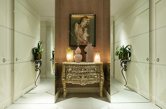
My interior design clients and friends have often suspected that I must have shares in Pilkingtons or a glass maker, as I am a fond and judicious user of mirrored glass.
Sometimes coloured, or textured glass as a wall finish.
I use plain sheet mirror ( very rarely bevelled unless it’s antique, pre- C1790 ) quite frequently in my designs. Used as an architectural staple, it can expand a space, cover unsightly awkward architectural features, and of course reflect and bounce much extra light around.
Mirror opposite mirror is interesting, but your walls must be completely parallel, then you will achieve an infinity effect , not for your Sitting Room perhaps, but amusing for a Guest Bathroom.
So these little tricks , I believe, have enhanced my interior design client’s projects and transformed their rooms, and given me a sense of order an appropriateness, often at no great cost.
More ‘dash than cash’ and definitely ‘ more bang for your buck’.
Stephen Ryan


Comments